Navigation elements and workflow are incorporated into render style and concept art for the Harry Potter interactive experience. Showing the overall navigation paradigm using the Marauder's Map and story locations to guide the promotional content and presentation.
Theatrical Web Design :: Harry Potter
Interactive experience for the Harry Potter Movie
You may also like

Electronica :: Music Genre Titles
2012
Mini-Portfolio
2017

Ruby Rhod TV
2022

M-GO BRANDING
2015

FUTURE OFFICE WEAR
2023

Cyborg Temple Guardians
2022

DATA SCIENCE TEAM
2022
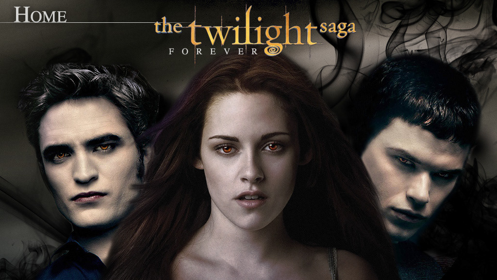
Tablet UI for Second Screen :: Entertainment
2013
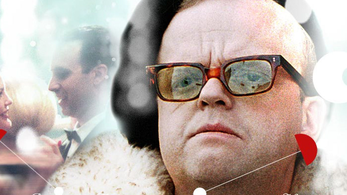
Retro Theatrical Website - Independent Release Teaser
2012
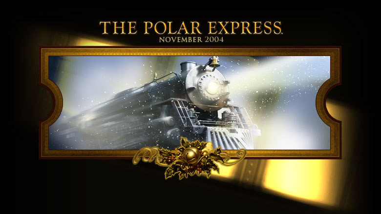
Polar Express Interactive Press Kit
2012
